 09
09Wrapture began as a passion project in 2008. There was no client brief and no commissioned application, only the idea of creating a distinctive identity around wrapping, colour and anticipation. An unknown private buyer later purchased the logo for $2,000 in 2010, but never disclosed the company or product it would represent.
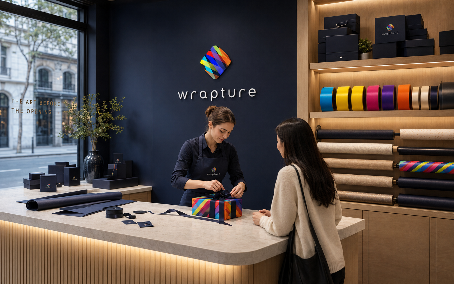
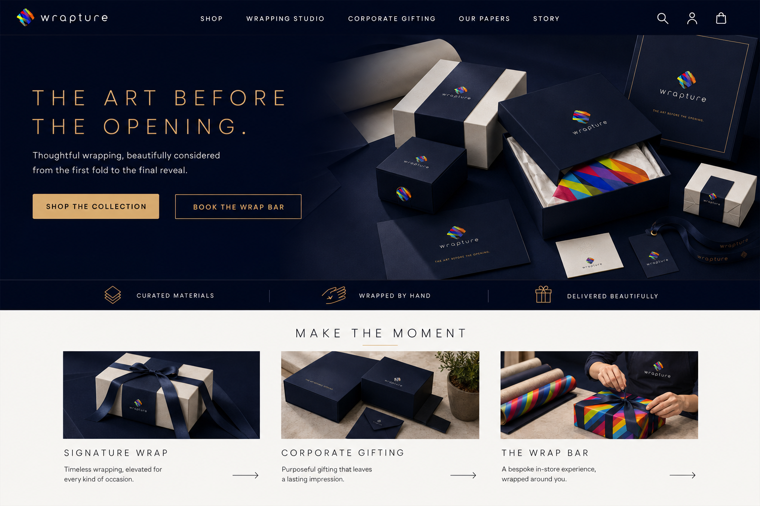
Because its eventual commercial use remains unknown, this portfolio edition does not attempt to recreate that history. Instead, it presents a clearly speculative brand world for a contemporary gifting and packaging studio, built around the original mark and the emotional moment before a gift is opened.
The challenge
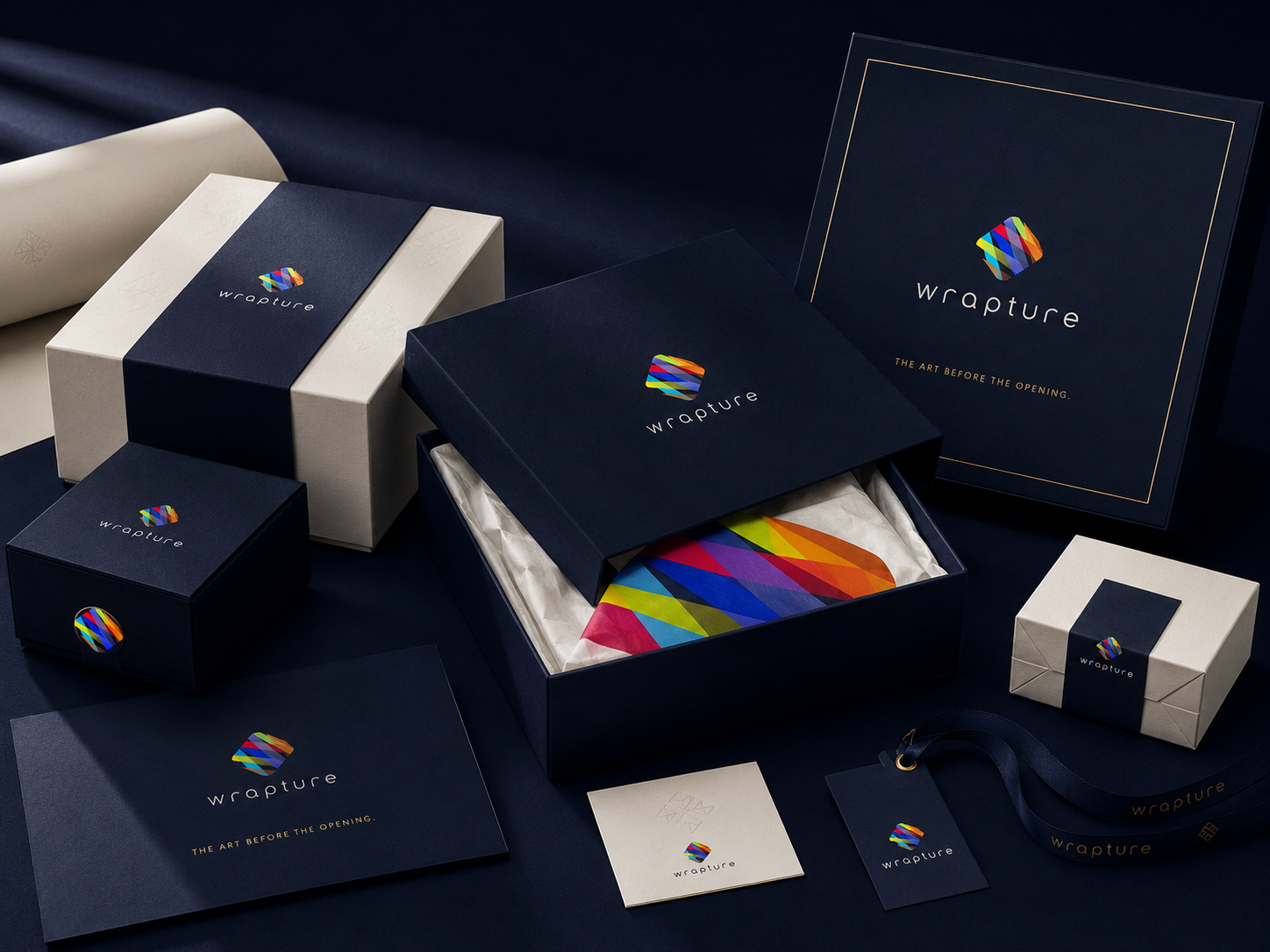
The original mark is colourful and expressive, but a premium gifting brand can quickly become visually busy, seasonal or overly playful. The expanded identity needed to preserve the energy of the logo while creating enough restraint, craft and sophistication to support luxury packaging, corporate gifting, retail service and e-commerce.
02The approach
I treated the icon as a folded object made from overlapping paper and ribbon. Midnight navy and warm white create the quiet foundation, allowing the original cyan, yellow, magenta, violet and orange to appear in controlled moments. Light geometric typography, generous spacing and tactile uncoated materials give the system a refined editorial character. The brand experience extends from the package itself to an in-store wrap bar and a design-led online shop.
03 / The resultThe art before the opening.
A one-off idea with a life of its own.
A speculative identity that demonstrates the range hidden inside the original 2008 mark. Wrapture can move from a small foil seal to an immersive boutique or digital storefront without losing its central promise: the presentation should make the moment feel special before the gift is even revealed.