 10
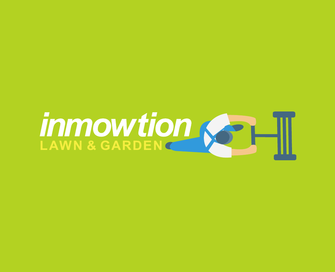
10Designed in 2011 for an Australian lawn and garden business, inMowtion turns the service itself into the centre of the identity. A top-down worker pushes a mower directly through the wordmark, making the brand active, memorable and immediately relevant.
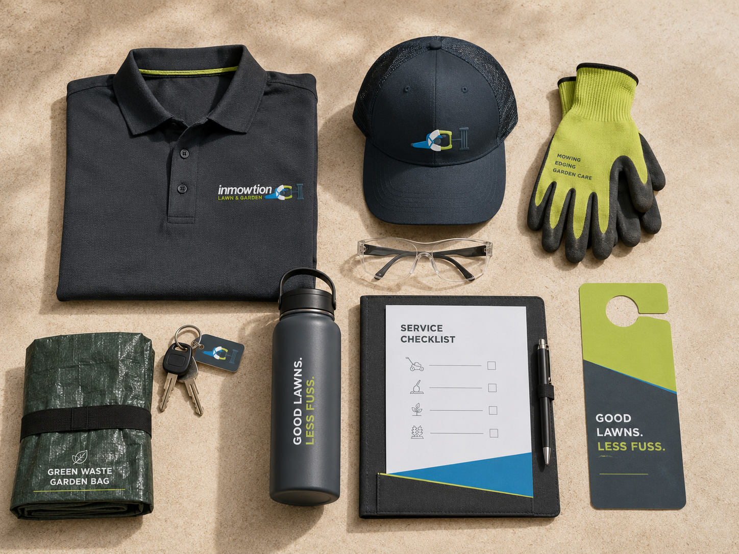
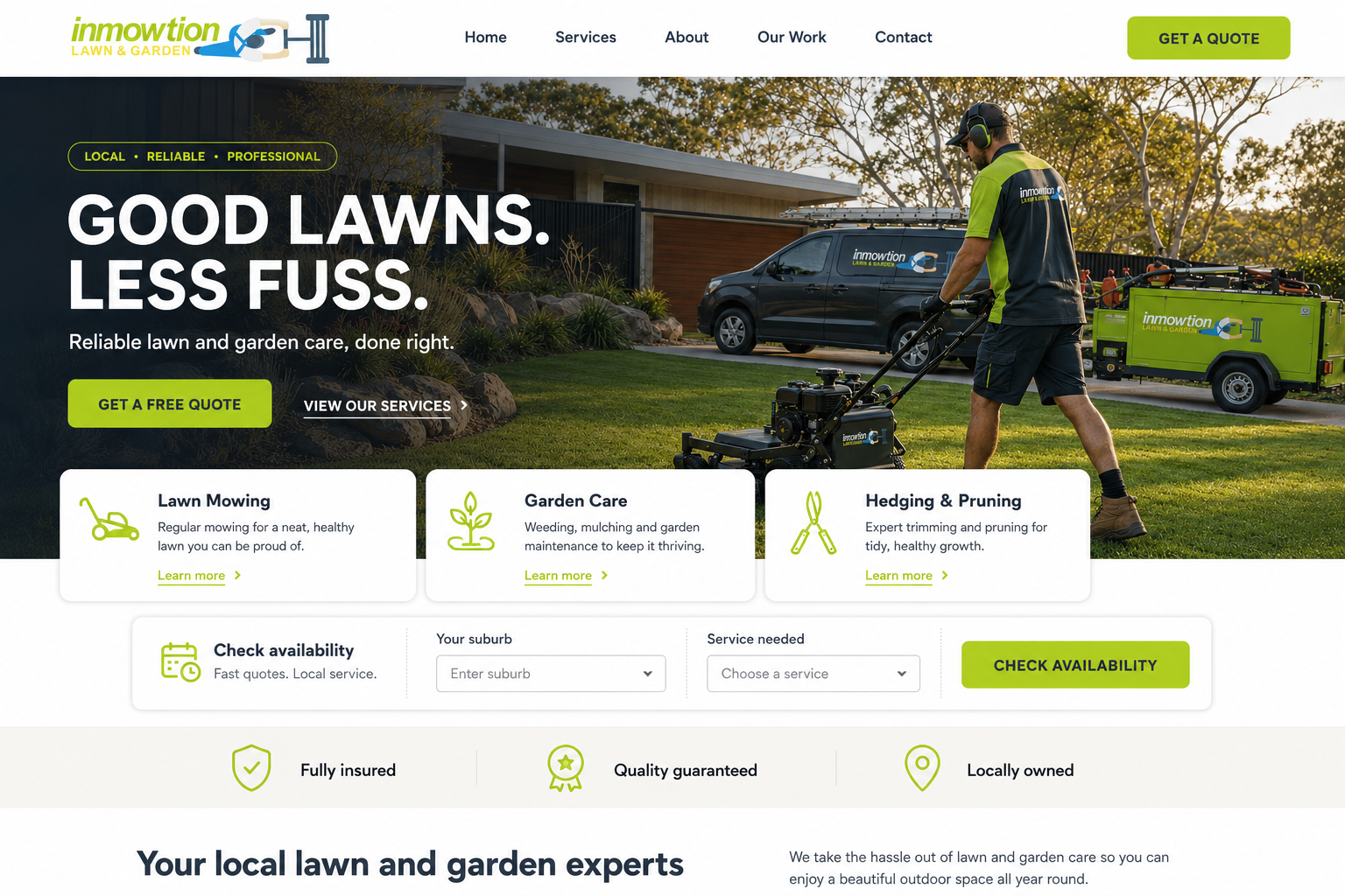
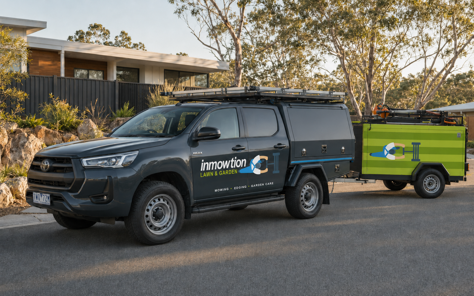
For this portfolio edition, I expanded the original mark into a complete residential-service system covering uniforms, vehicle and trailer graphics, customer materials and a booking-focused digital experience.
The challenge
Residential lawn-care identities often rely on the same leaves, grass blades and generic green palettes. inMowtion needed to feel friendly and dependable while remaining visible on suburban streets, easy to recognize at a glance and practical across vehicles, workwear and small customer touchpoints.
02The approach
I kept the original worker-and-mower idea at the centre of the system. Lime signals growth and gives the brand high visibility, slate adds credibility, blue brings freshness and warm sand keeps the palette approachable. On the trailer, alternating horizontal greens suggest the striped paths left by a freshly mown lawn. Branding is deliberately restrained, with one primary door logo and a simplified mower figure used as the supporting symbol.
03 / The resultGood lawns.
Less fuss.
A friendly, field-ready identity that feels organized without becoming corporate. The system moves naturally from the driveway to the uniform, service checklist and quote form, giving customers the same clear promise at every touchpoint: reliable care, a tidy finish and less fuss.