 11
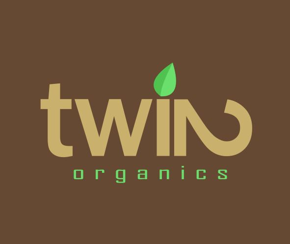
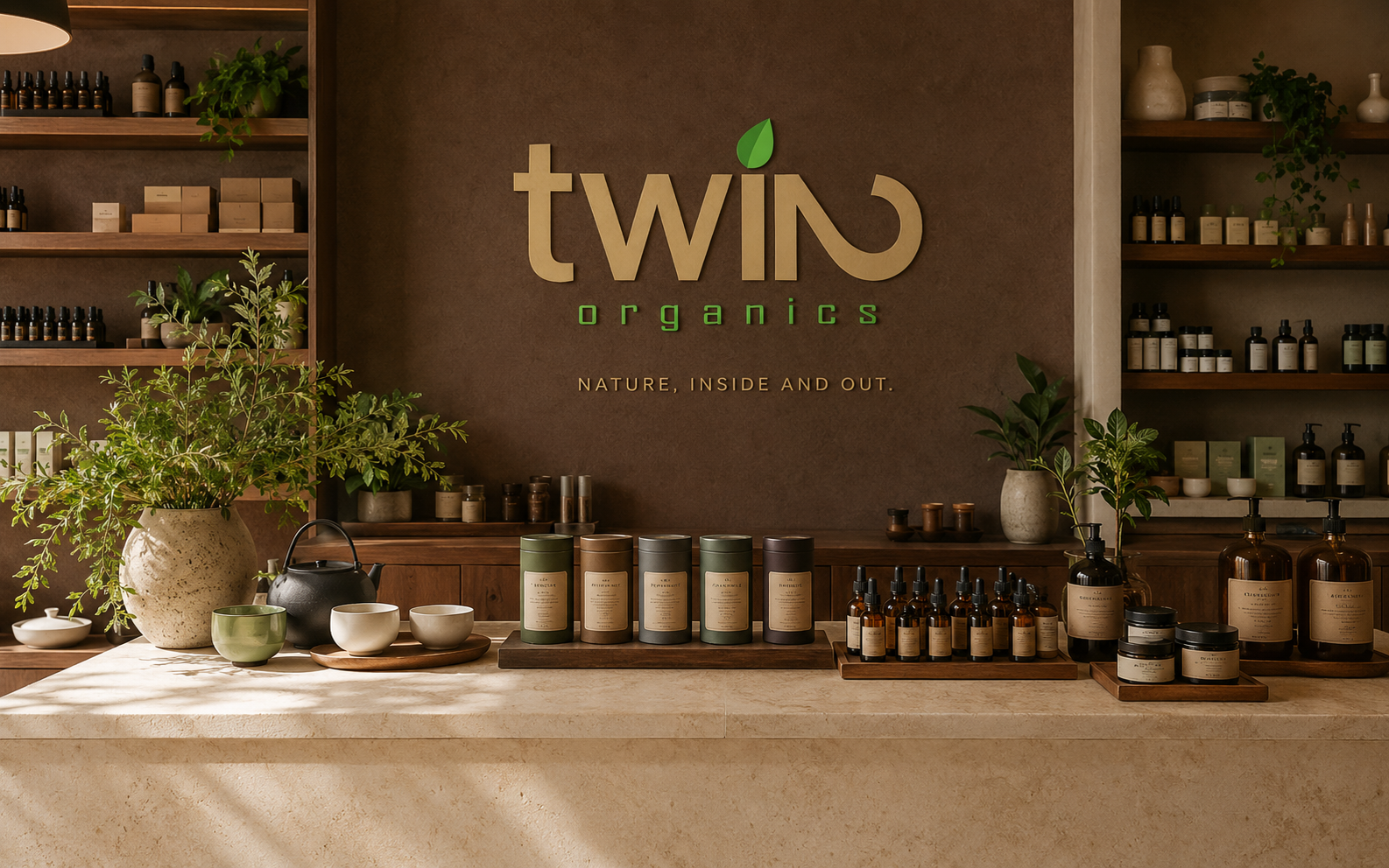
11Twin Organics brings organic tea, essential oils and botanical skincare together under one idea: natural care should support wellbeing from within and at the surface. The wordmark builds the idea of twinness directly into the name. The first three letters, ‘twi,’ are intentionally lowercase, while a number 2 rotated 90 degrees clockwise completes the word as a stylized uppercase ‘N.’ One character carries two meanings, giving the identity a distinctive signature that is both clever and purposeful.
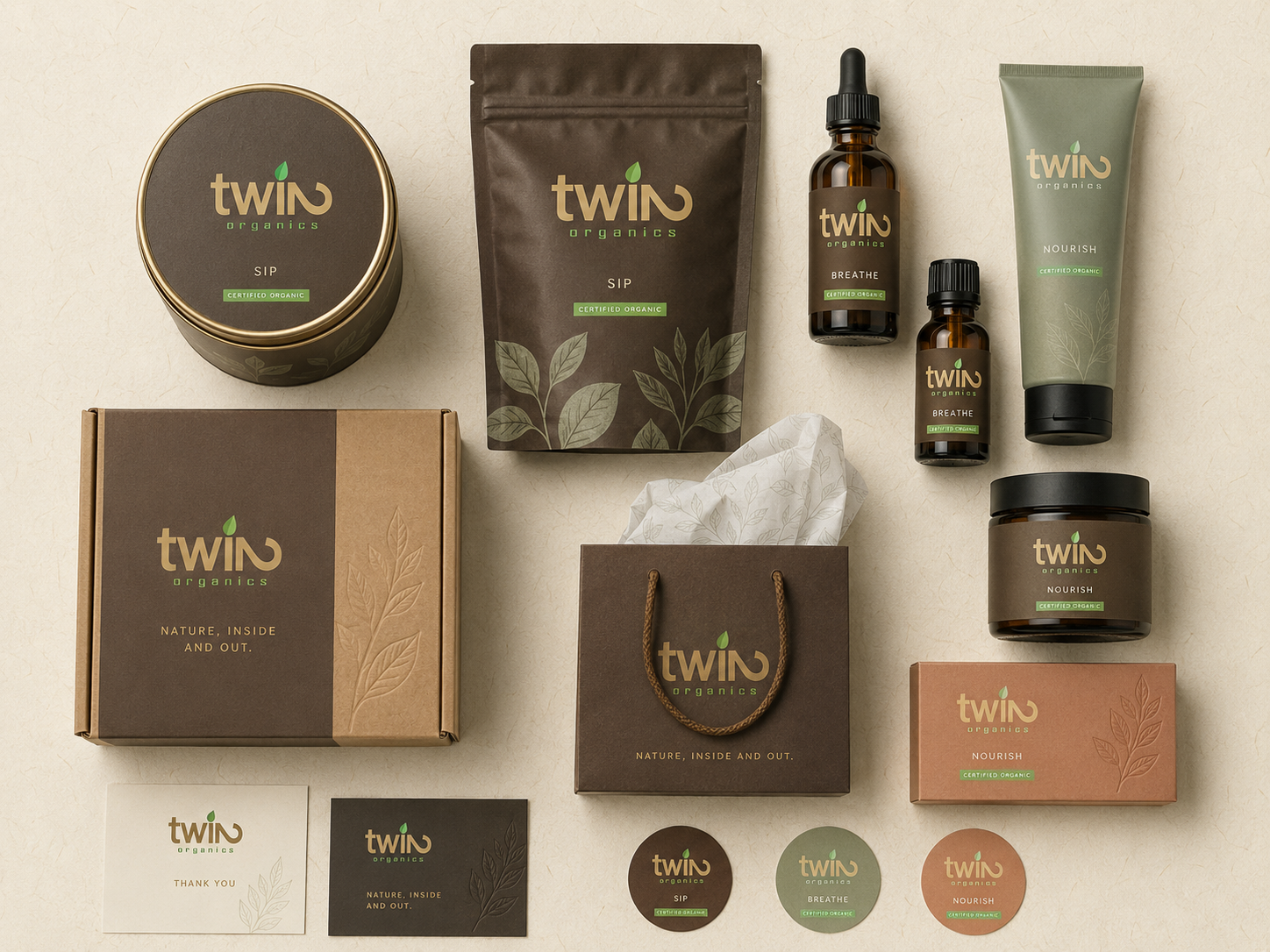
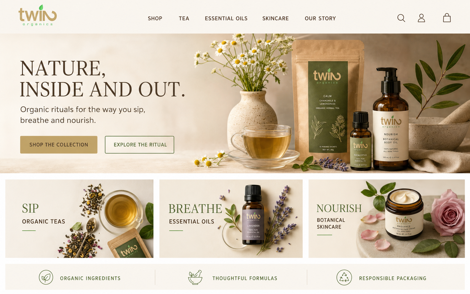
For this portfolio edition, I expanded the logo into a complete natural-wellness system covering product architecture, packaging, retail space and a polished e-commerce experience.
The challenge
Tea, aromatherapy and skincare often speak in completely different visual languages. The identity needed to hold all three categories together without becoming a generic spa brand, a rustic health-food label or an overly clinical wellness company. It also needed enough structure to help customers understand the range immediately.
02The approach
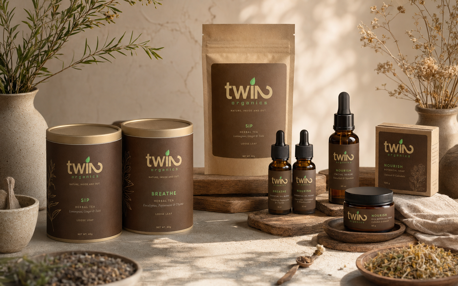
I made the wordmark's built-in duality the strategic foundation. Lowercase ‘twi’ leads into a rotated number 2 that resolves as an uppercase ‘N,’ turning the idea of twinness into a memorable piece of typography. That visual pairing became a natural framework for a brand devoted to care from the inside and out. The range is organized through three simple rituals: Sip for organic teas, Breathe for essential oils and Nourish for botanical skincare. Cocoa brown and harvest sand give the system warmth and authority, while leaf green, sage, cream and a restrained clay accent distinguish the product families. Tactile papers, amber glass and quiet botanical linework keep the experience grounded and credible.
03 / The resultNature, inside.
And out.
A calm, cohesive brand world that can move from a tea tin to a facial serum, retail shelf or online store without losing its identity. The product families are easy to navigate, the materials feel considered and the original rotated 2 becomes a meaningful symbol of balanced, everyday wellbeing.