 12
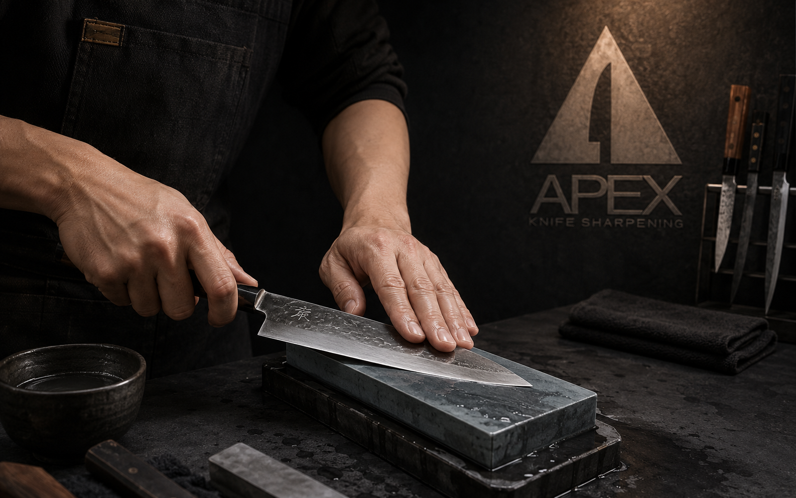
12Apex Knife Sharpening is built around a simple truth: a sharp tool changes the rhythm of the work. Positioned for chefs, restaurants and serious home cooks, the brand treats sharpening as a precise professional service rather than a basic repair.
The original mark already contains the idea. Its triangular form rises to an apex while the central negative space cuts upward like a knife blade. For this portfolio edition, I expanded that compact symbol into a complete service identity spanning the workshop, mobile restaurant program, customer materials and digital booking experience.
The challenge
Knife-sharpening identities often lean toward generic blade graphics, aggressive tactical styling or old-fashioned trade imagery. Apex needed to communicate technical expertise and serious performance without feeling intimidating. It also had to earn trust in two very different settings: a professional restaurant kitchen and the home of an individual knife owner.
02The approach
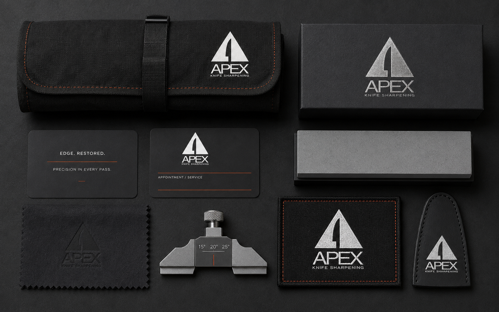
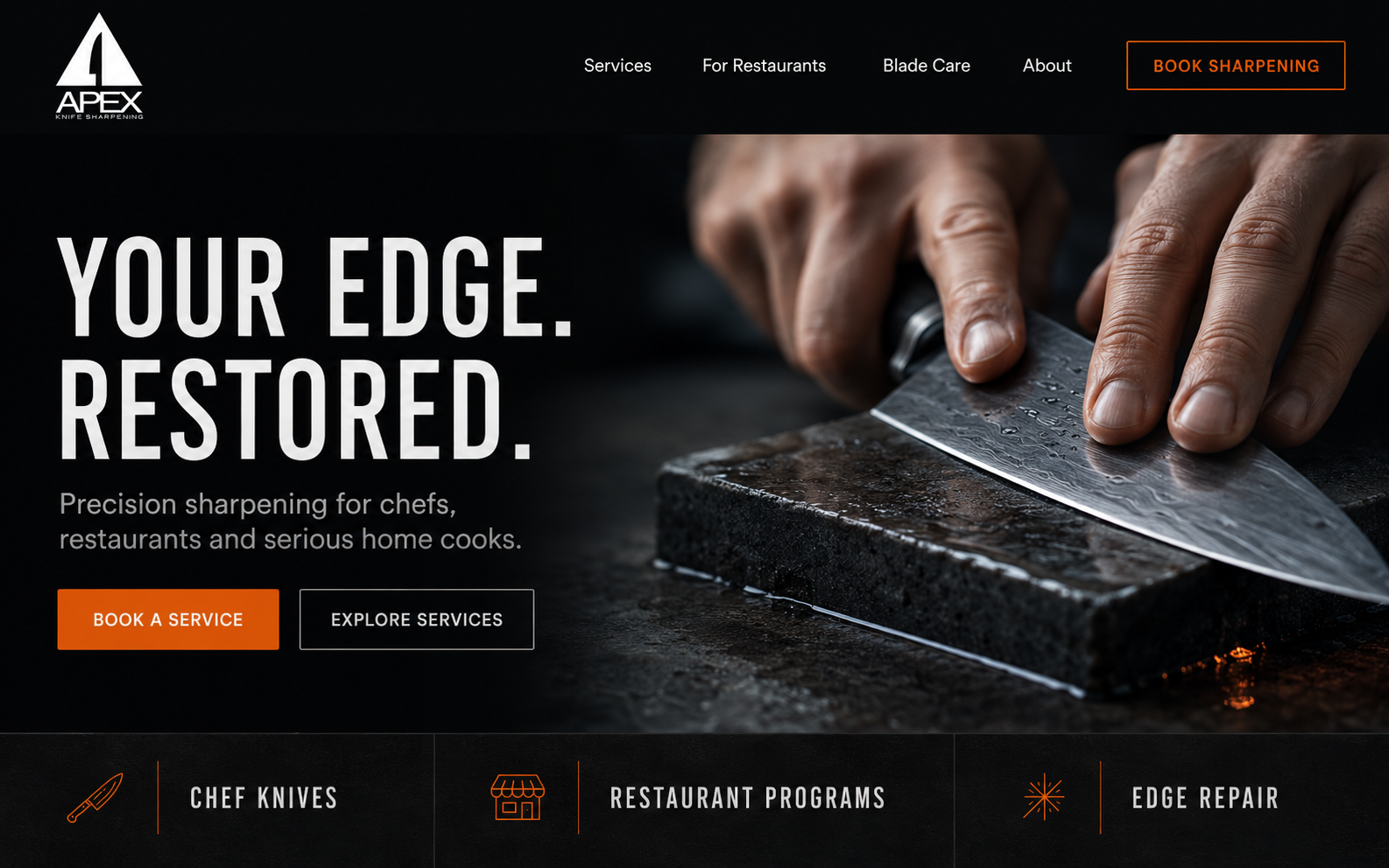
I let the original blade-and-apex symbol carry the identity, supported by a disciplined palette of obsidian, graphite, brushed steel and bone white. A restrained ember-orange accent marks calls to action, service details and moments of precision. Clean technical typography, tactile black materials and organized layouts reinforce the care behind the process. The tone stays calm and assured, led by one clear promise: Your edge. Restored.
03 / The resultYour edge.
Restored.
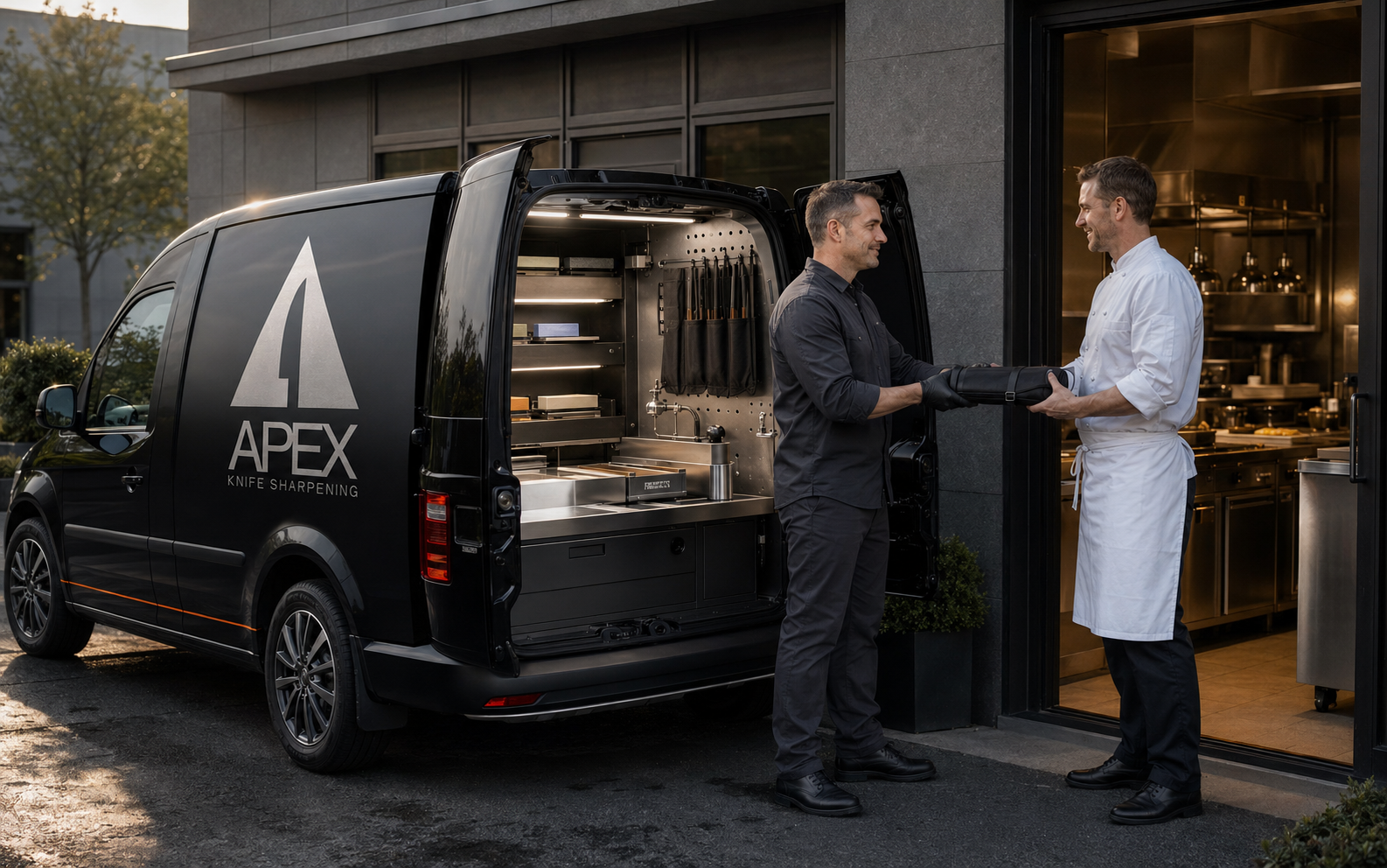
A premium, service-driven identity that feels equally credible on a workshop wall, knife roll, service card, mobile sharpening van or booking page. Every application reflects the same standard: measured technique, organized service and a restored edge that lets the tool perform as intended.