 05
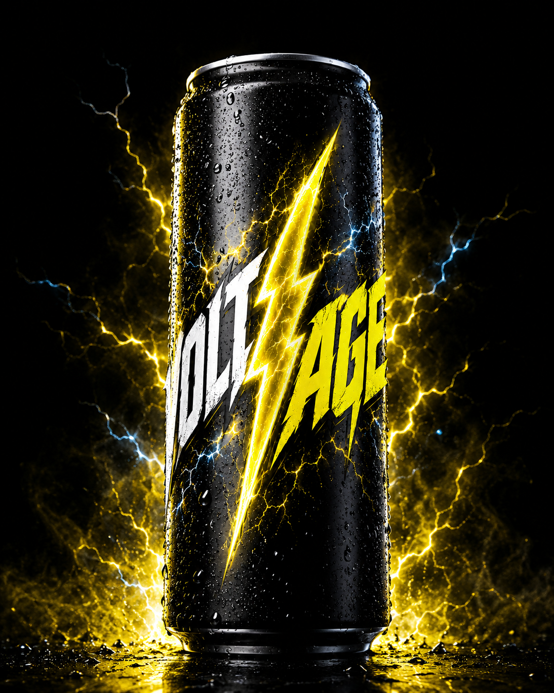
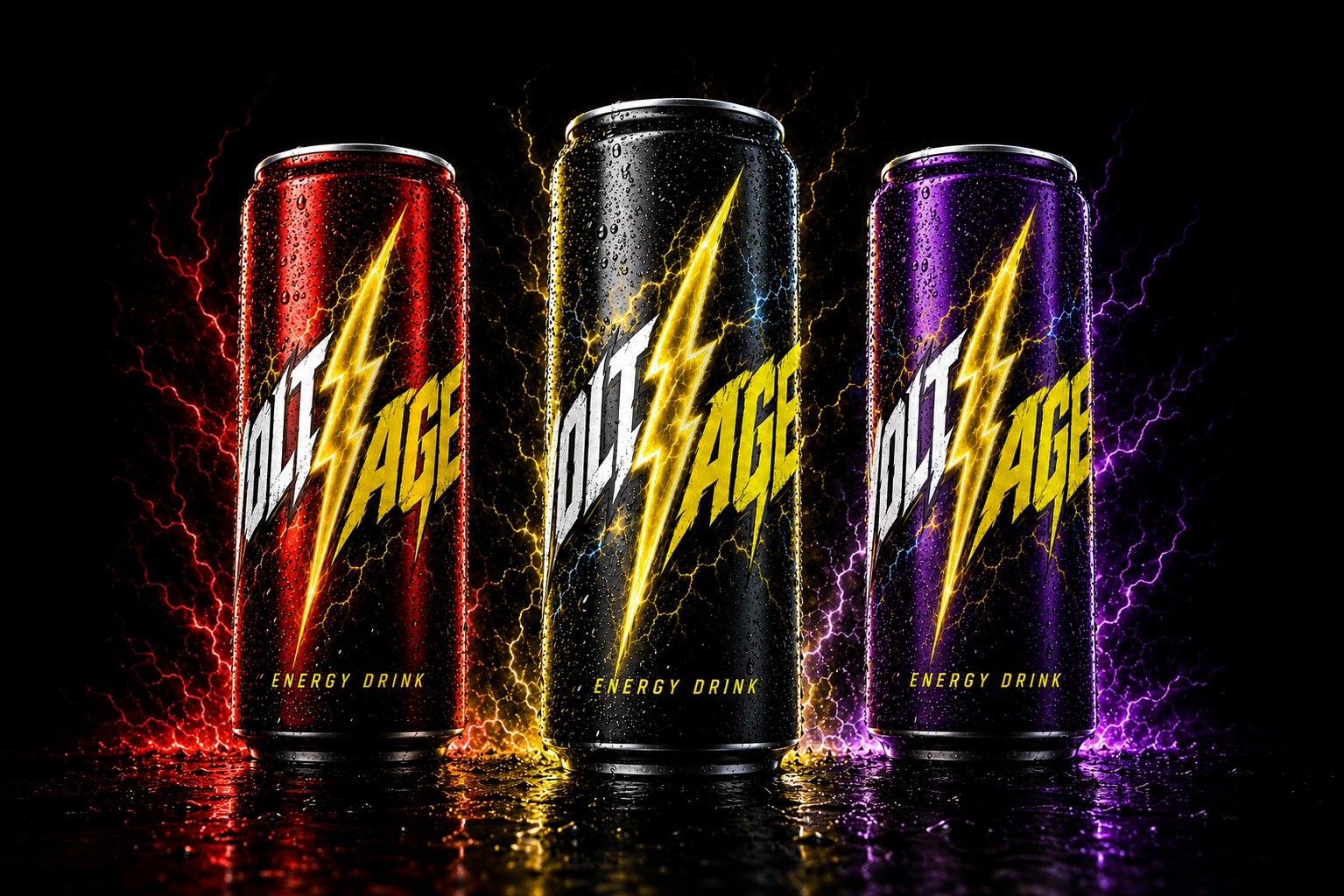
05VOLT/AGE is a self-initiated energy drink concept created for people who treat momentum as a competitive advantage. The brand needed to feel immediate, physical and impossible to ignore without becoming another generic extreme-sports label.
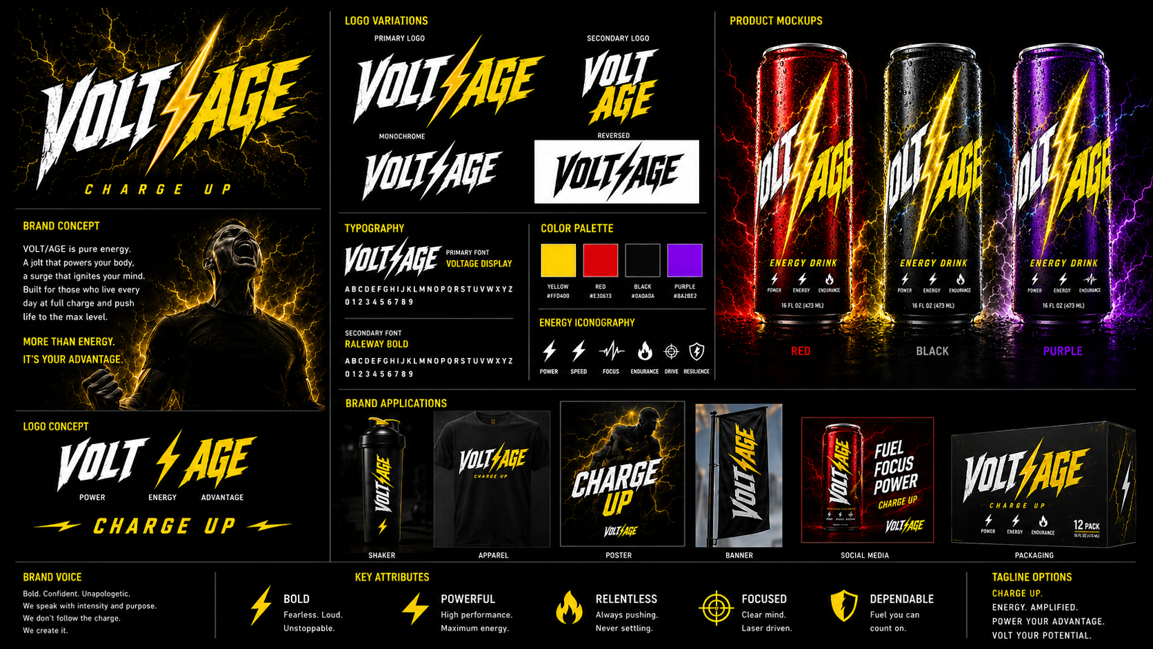
The identity turns the name into the central idea. VOLT communicates raw power, AGE completes the promise of advantage, and the lightning bolt between them becomes the visual charge running through every application.
The challenge
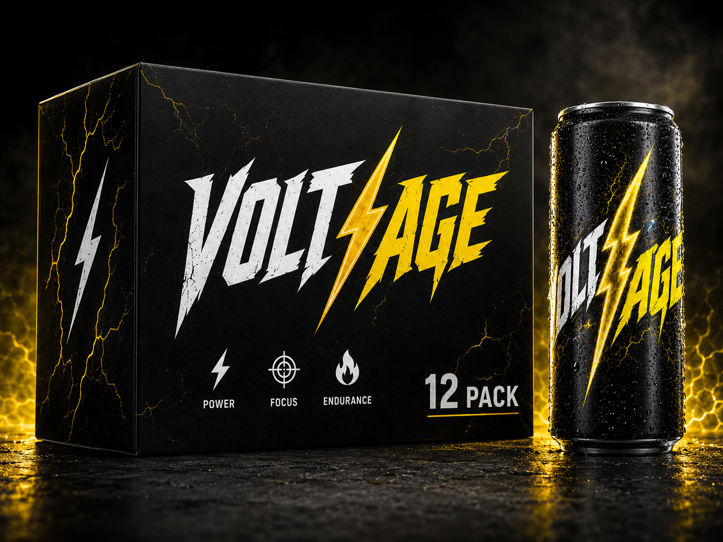
Energy drinks compete in one of the loudest consumer categories. VOLT/AGE needed enough impact to own a shelf from several feet away, while still having a clear system for flavours, packaging, campaign imagery and merchandise. The identity also had to communicate intensity without relying on unsupported performance claims.
02The approach
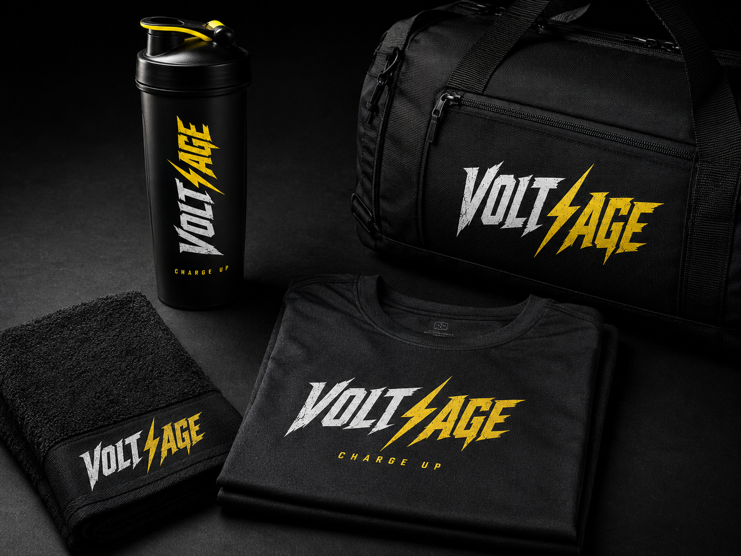
I built the system around contrast and controlled impact. Distressed angular lettering gives the wordmark speed and attitude, while a central lightning bolt acts as both separator and brand symbol. Black and electric yellow establish the master identity, with red and purple extending the range. Condensed typography, focused iconography and charged product photography carry the same energy across every touchpoint.
03 / The resultBuilt to hit hard.
Designed to hold together.
A complete high-energy brand world with a recognizable shelf presence and enough flexibility to move naturally from cans and cartons to apparel, campaign imagery and digital content. Every element reinforces one focused idea: more than energy, it is your advantage.