 08
08Originally designed in 2008, Viper Drilling began with a direct visual idea: turn the letter I into a drill shaft and pointed bit, then coil a viper around it. The mark brought the company name, the work and the controlled danger of the industry together in one compact symbol.
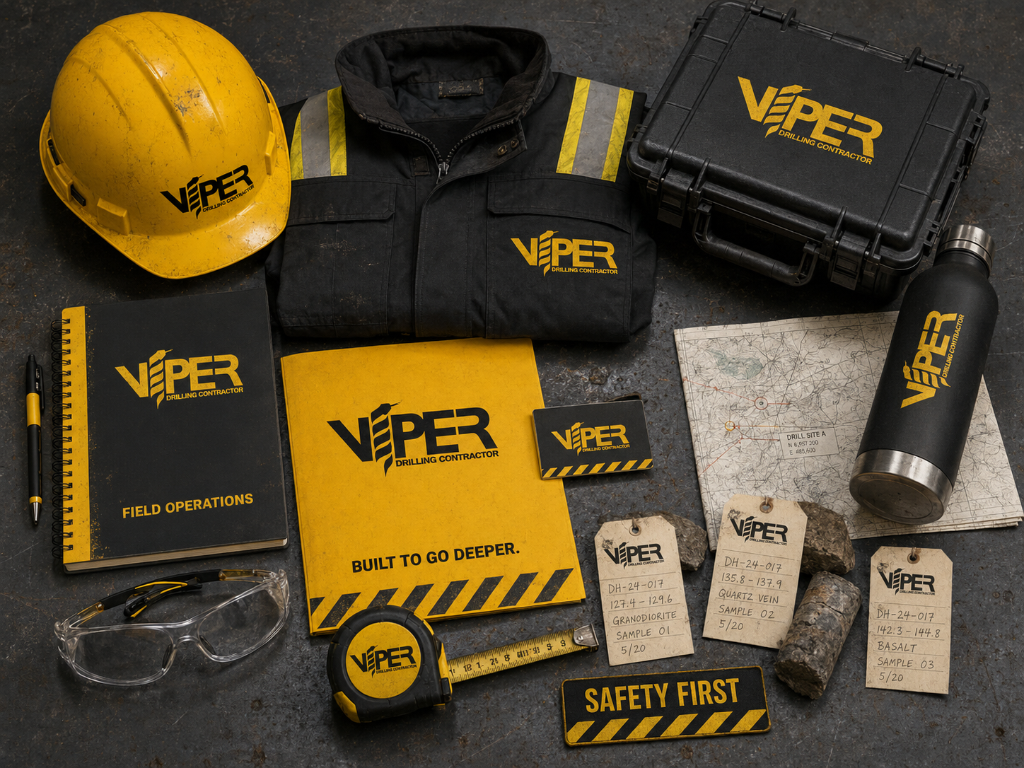
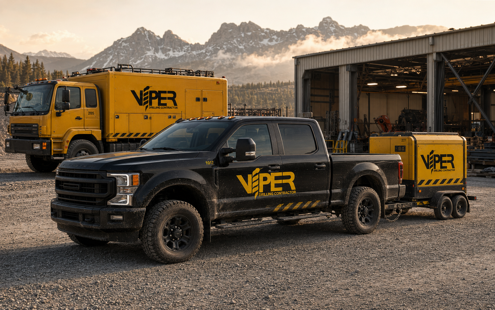
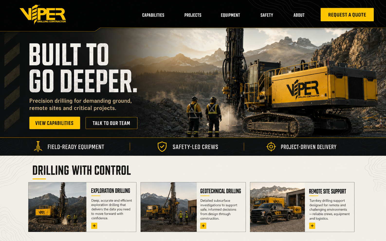
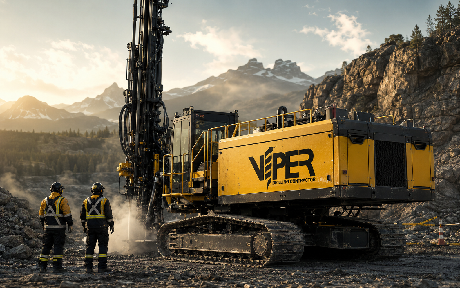
For this portfolio edition, I expanded the original logo into a complete contemporary identity for a field-ready drilling contractor. The system now extends across heavy equipment, fleet graphics, safety materials, project documentation and a digital experience built for capability-driven buyers.
The challenge
Industrial drilling brands need to communicate strength without looking reckless, and technical capability without becoming anonymous. Viper needed to feel tough enough for remote and demanding sites while still projecting precision, disciplined operations and a serious safety culture.
02The approach
I kept the original 2008 mark as the anchor. The drill-shaft I communicates the service immediately, while the coiled viper suggests alertness, control and decisive movement. Industrial yellow and carbon black create high visibility across machinery and vehicles. Steel grey, warm dust and off-white support technical documents and digital interfaces. Condensed typography, angular geometry and topographic details give the system a consistent field-engineering character.
03 / The resultBuilt to go deeper.
Designed to stay in control.
A bold industrial identity that moves naturally from a drilling rig to a hard hat, equipment case, service truck or website. The expanded system makes the original mark feel operational, not ornamental, with every touchpoint reinforcing precision, readiness and controlled performance.