 07
07Originally designed in 2009, Shark Tours began with one compact visual idea: combine the profile of a shark with the speed and structure of a tour vessel. The result was a bold mark that could communicate the experience before the boat ever left the harbour.
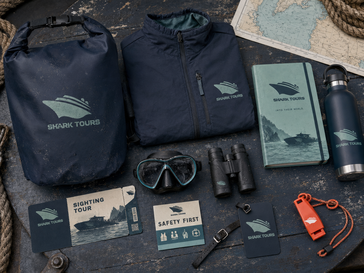
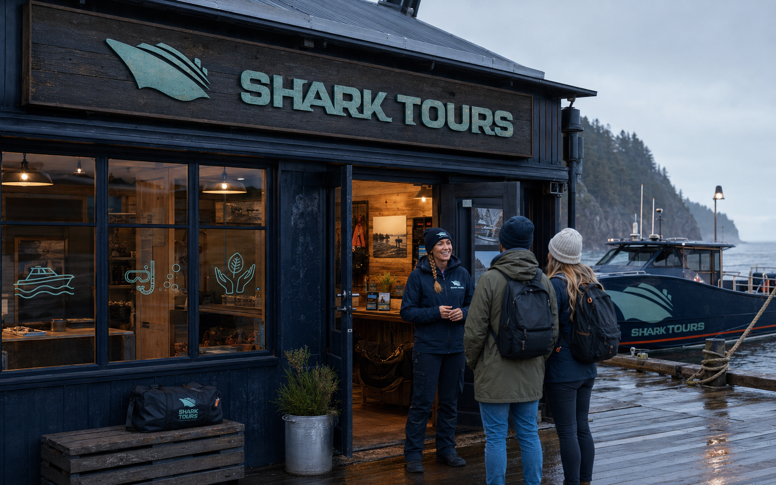
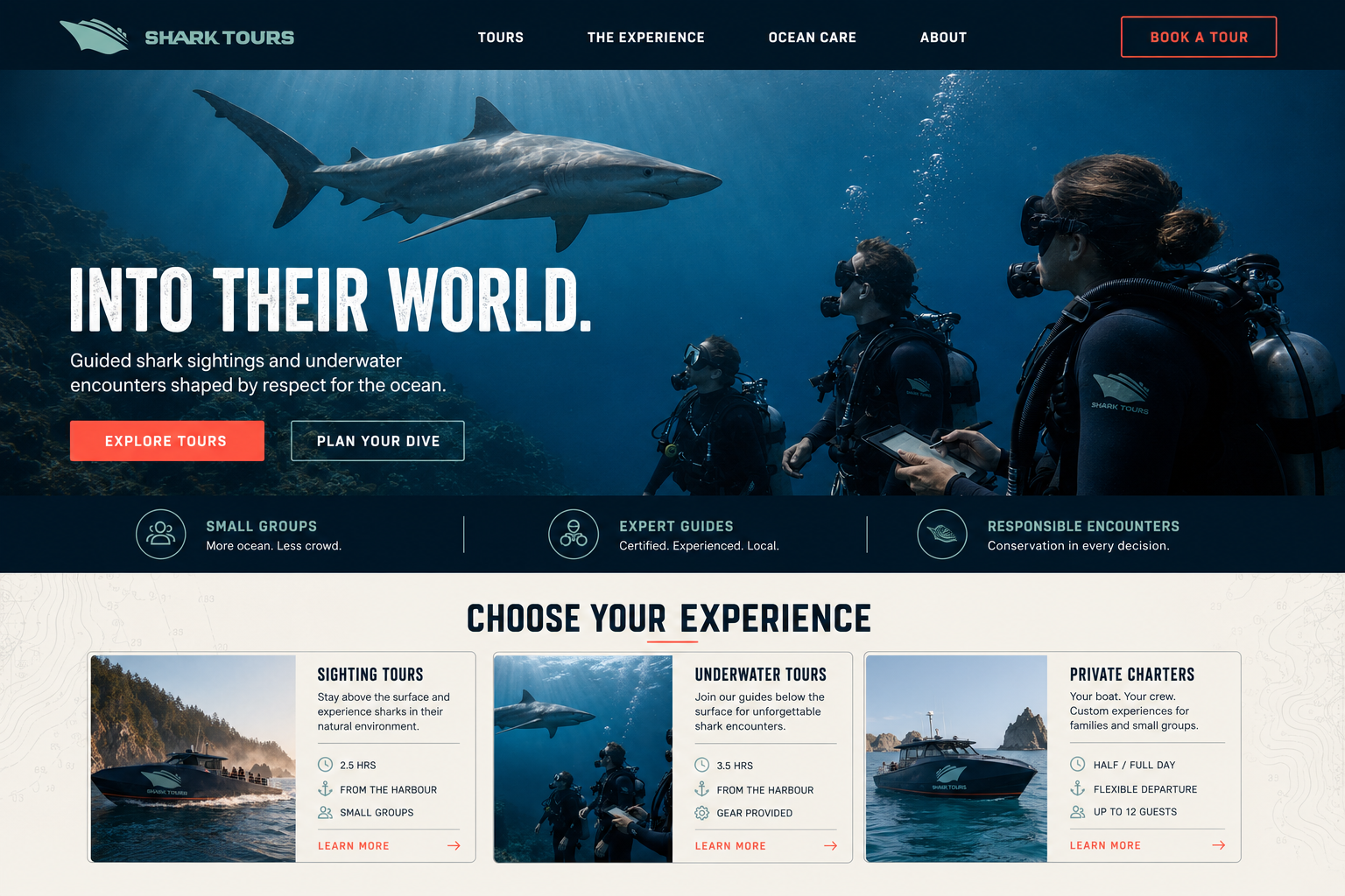
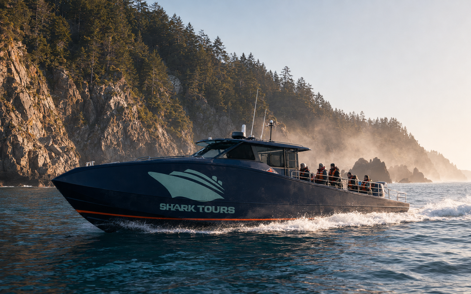
For this portfolio edition, I returned to the original logo and built the wider brand world it always suggested. The identity now extends across vessel livery, guest equipment, dockside signage, underwater photography and a complete digital booking experience.
The challenge
Shark tourism can easily drift toward fear, spectacle and familiar open-jaw imagery. The brand needed to promise a genuine adventure while also communicating professional guidance, guest safety and respect for marine life. It also had to remain recognizable on a moving vessel, underwater equipment and information-heavy digital touchpoints.
02The approach
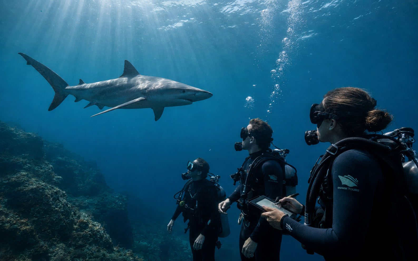
I kept the original 2009 mark at the centre of the system. Its shark silhouette also reads as a fast passenger vessel, allowing the logo to connect the animal directly to the experience. Abyss navy and deep ocean blue establish authority, while aged seafoam gives the applications a practical marine character. Small coral accents identify actions and safety information. Photography focuses on scale, discovery and respectful observation rather than manufactured danger.
03 / The resultInto their world.
With respect at every step.
A complete marine-adventure identity that turns an early logo idea into a credible customer experience. Every touchpoint supports the same promise: memorable shark encounters led by expertise, organized around safety and shaped by respect for the ocean.