 03
03EcoSpade is a spa and relaxation retreat built around nature and calm — a place designed to slow your pulse the moment you step inside.
Its mark holds three ideas in a single stroke: a leaf for nature, a spade for the name, and the curl of a lowercase ‘e’ for Eco — one quiet, organic form that reads differently the longer you look at it.
The challenge
Wellness is a crowded shelf in branding — the same leaves, greens, and calm. EcoSpade needed a mark that felt genuinely crafted and distinct, and a name that was half ‘eco,’ half ‘spade’ — something the logo had to earn, not just decorate.
02The approach
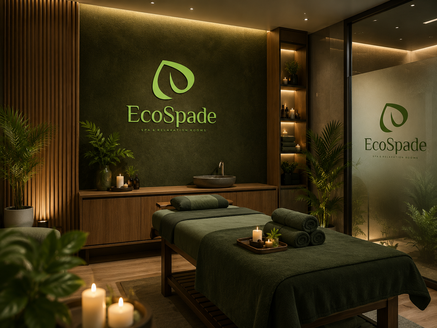
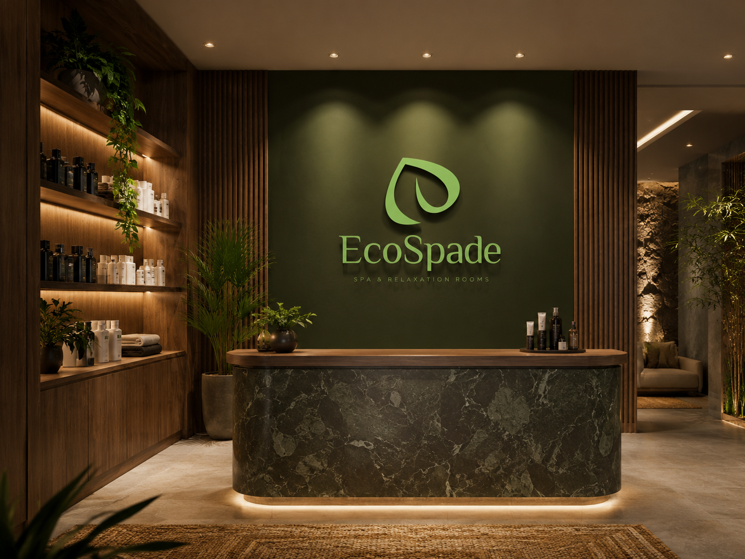
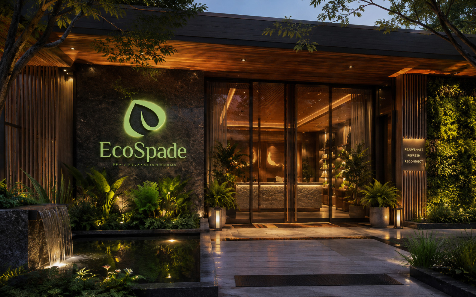
I folded the entire name into one symbol. A single leaf doubles as a garden spade and curls into a lowercase ‘e’ — nature, cultivation, and the brand initial held in one continuous shape. The green-and-amber system carries the calm from the entrance through every treatment room.
03 / The resultDesigned to work
beyond the reveal.
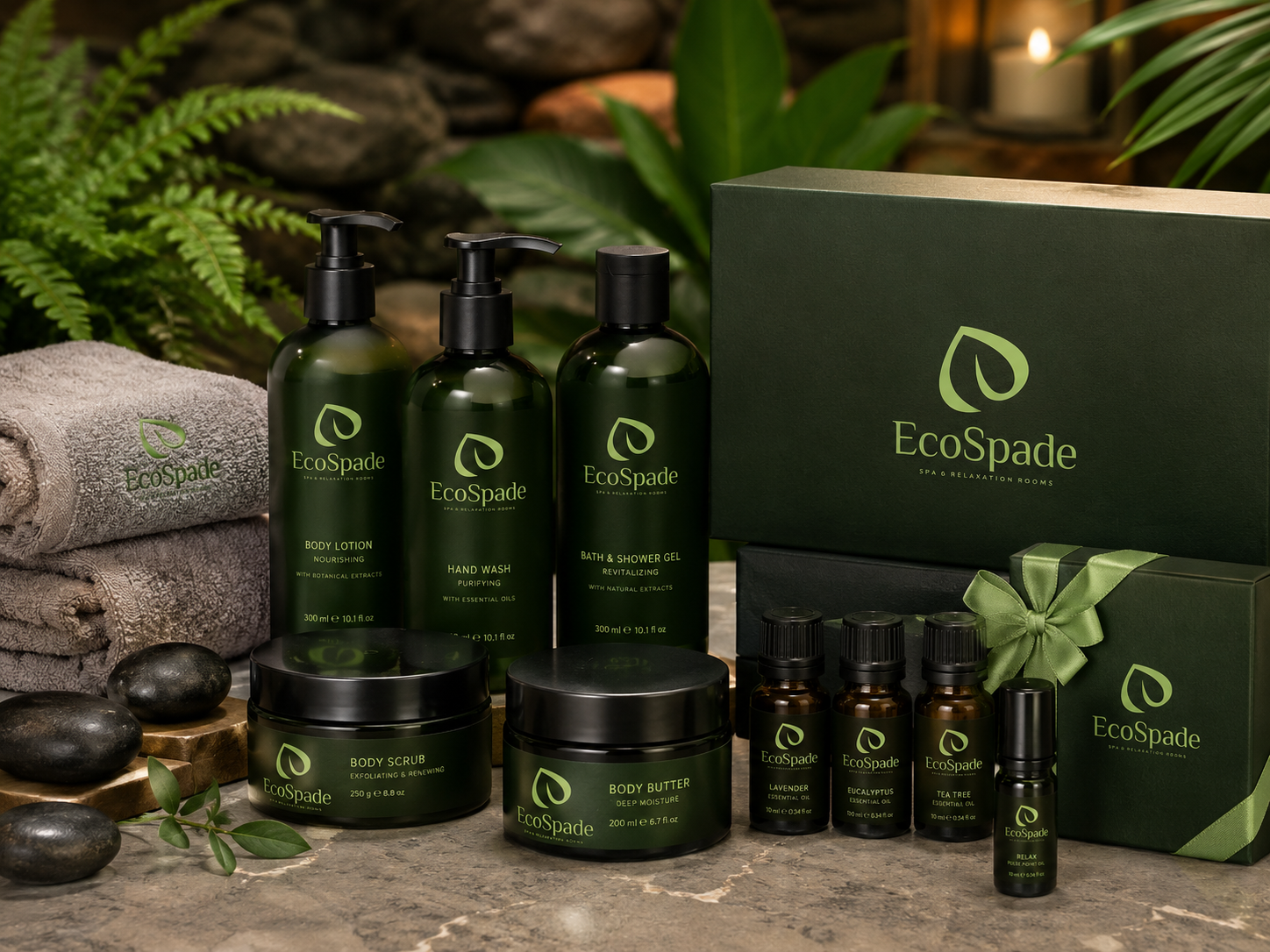
A restorative visual world with one memorable organic symbol at its centre, expressed consistently through space, signage, and a complete product range.