The challenge
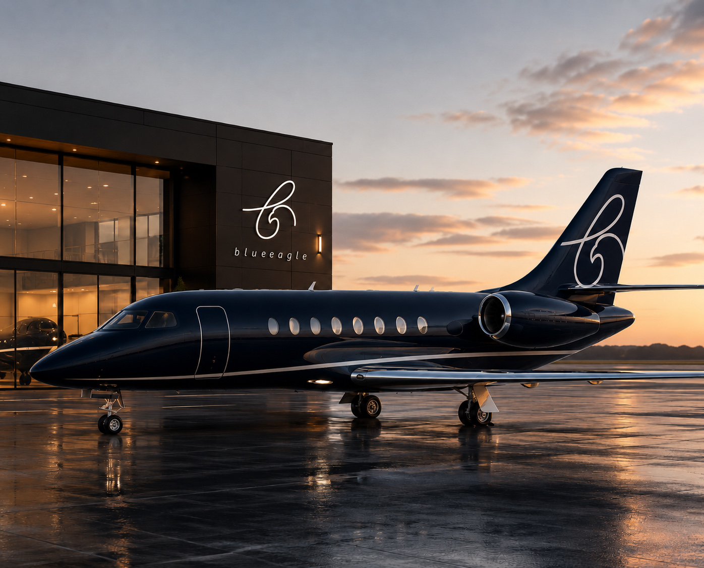
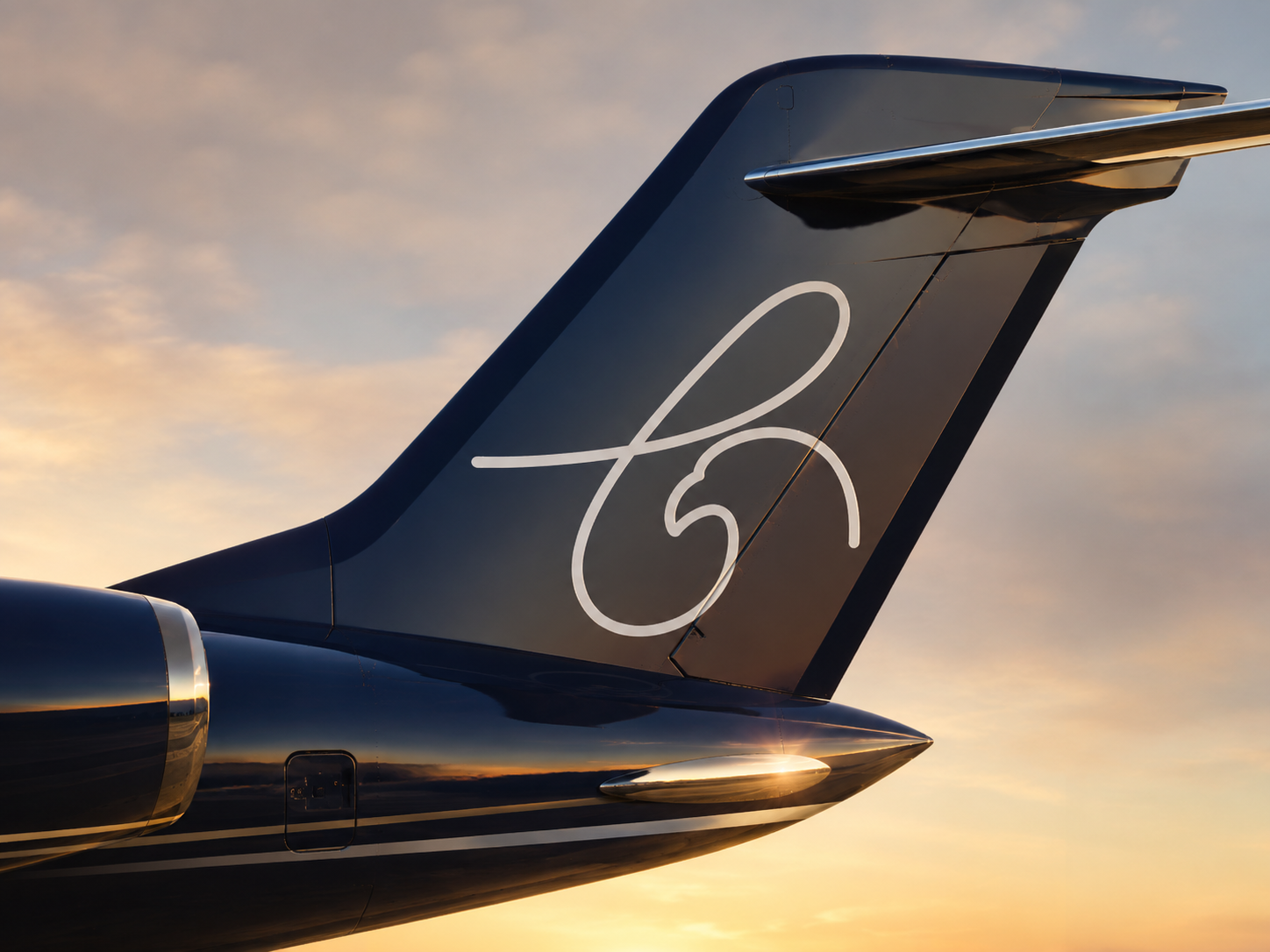
Private aviation is sold on trust and taste, not volume. The mark had to feel personal at the scale of a business card and commanding on an aircraft tail — with an idea elegant enough that clients would feel it before they noticed it.
 in line identity
 02
02Blue Eagle is a private aviation company built on a simple promise: the journey should feel as effortless as the destination. The identity had to carry that quiet confidence — luxury that whispers rather than shouts.
At its heart is a mark with a secret. A single cursive stroke spells a lowercase ‘b’ — and in the same line, the proud profile of an eagle’s head. One gesture, two readings: the name and its namesake, drawn without lifting the pen.
Private aviation is sold on trust and taste, not volume. The mark had to feel personal at the scale of a business card and commanding on an aircraft tail — with an idea elegant enough that clients would feel it before they noticed it.
I found the eagle hiding inside the letter. The lowercase ‘b’ is drawn as one continuous cursive line that resolves into an eagle’s head. Set in deep midnight blue beneath a hairline wordmark, the mark was built tail-first, then carried into livery, hangar signage, boarding passes, and print.
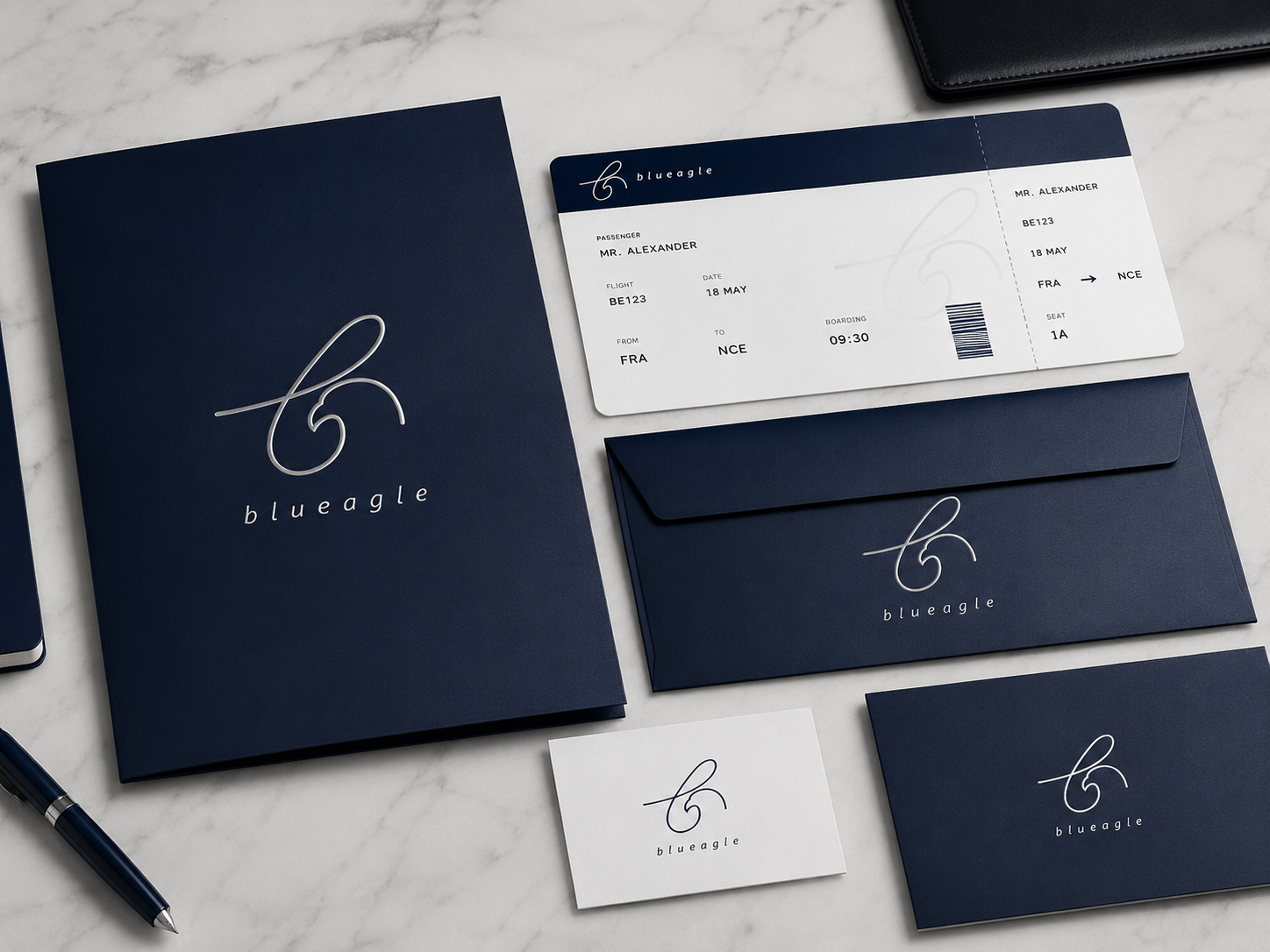
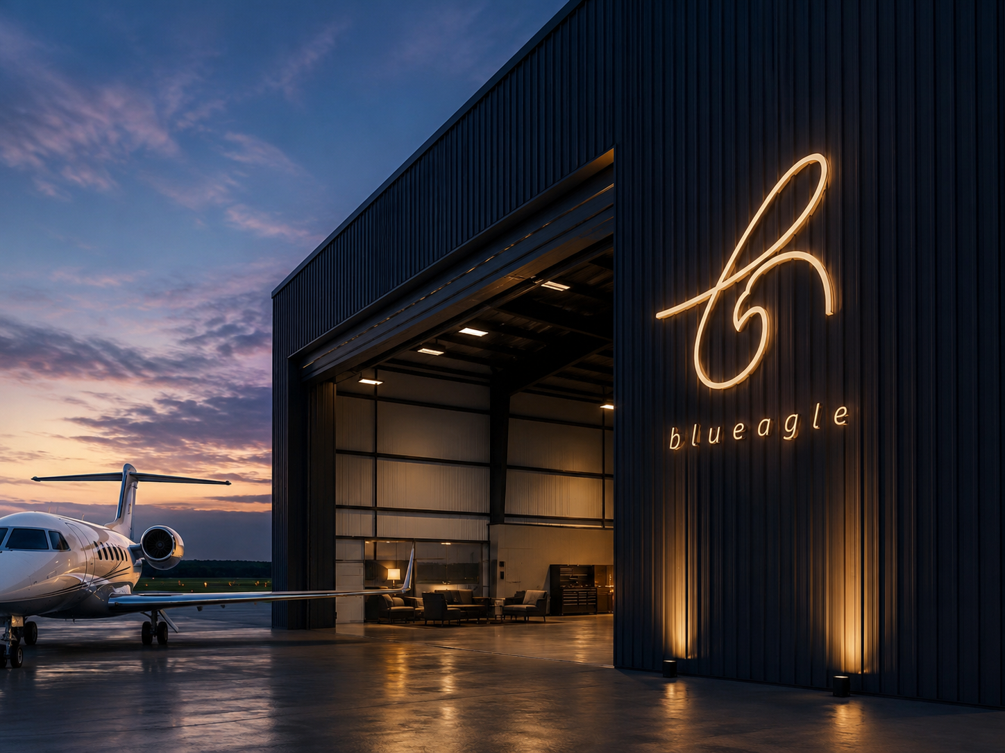
A quiet, premium identity whose single-line mark remains intimate in print and unmistakable at aviation scale.